Editor's note: In December, macroblog will become part of the Atlanta Fed's Policy Hub publication.
Here are two charts that I think are very telling for the recovery of the U.S. labor market. Chart 1 shows the unemployment rate for people who reported being temporarily laid off from their job and anticipate being recalled. Chart 2 shows the unemployment rate for those who reported being laid off permanently, with no prospect of being recalled. They are on very different trajectories.
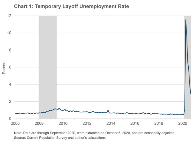
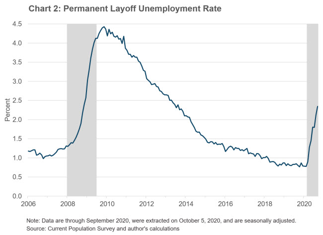
I've computed these rates as a share of the civilian labor force. Other reasons for unemployment include reentrants or new entrants to the labor force as well as those completing temporary jobs and are not shown.
The good news is that after increasing to a never-before-seen level in April, the temporary unemployment rate has improved markedly as many businesses have reopened and recalled their temporarily laid-off staff. The bad news is that as the pandemic has unfolded, an increasing number of unemployed workers are reporting being laid off permanently—and they account for a rising share of the labor force. Those on permanent layoff have a lower rate of reemployment in general than those on temporary layoff, and the flow into employment is currently similar to the low level seen in the wake of the Great Recession. Also troubling is the fact that the reemployment rate of those on temporary layoff is also lower than normal—meaning that for some, temporary is starting to look more permanent.
While the level of permanent layoffs is not close to that seen during the Great Recession, the increase indicates that a near-term return to prepandemic labor market conditions is unlikely. In fact, as last week's macroblog post pointed out, survey evidence suggests that many firms don't anticipate getting back to prepandemic employment levels for several years.
 By John Robertson, a senior policy adviser in the Atlanta Fed's Research Department