In a recent speech, Federal Reserve Bank of San Francisco President John Williams suggested that signs of imbalances were starting to emerge in the form of high asset prices, particularly in real estate. He pointed out that the house price-to-rent ratio had returned to its 2003 level and that, while it may not be at a tipping point yet, it would be important to keep an eye on the situation and act before the imbalance grows too large. President Williams is not the only one monitoring this situation. Many across the industry are keeping a watchful eye on the rapid price appreciation (see here, here, and here), including my colleagues and me at the Atlanta Fed.
While it is too soon to definitively know if a bubble is forming, the house price-to-rent ratio seems like a relevant measure to track. Why? Basically, because households have the option to rent or own their home, equilibrium in the housing market is characterized by a strong link between prices and rents. When prices deviate substantially from rents (or vice versa), the cost-benefit calculus in the rent-versus-own equation changes, inducing some households to make a transition. In effect, these transitions stabilize the ratio.
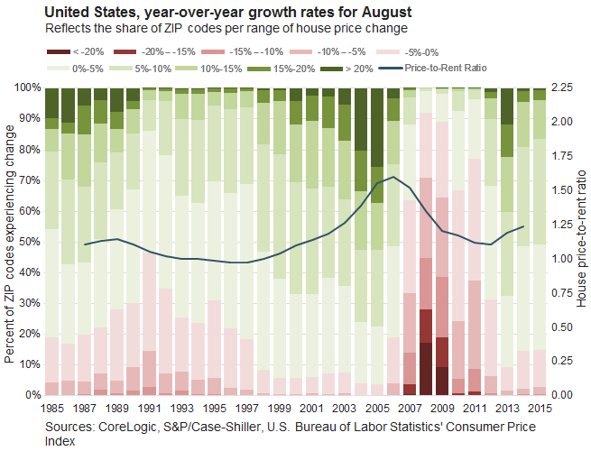
In an effort to better understand house price trends, we chart the house price-to-rent ratio at an annual frequency on top of a stacked bar chart depicting year-over-year house price growth (see chart below). Each stacked bar reflects the share of ZIP codes in each range of house price change. Shades of green indicate house price appreciation from the year-earlier level, and shades of red indicate house price decline. The benefit of considering house price trends through the lens of this stacked bar chart is, of course, that it provides a better sense for the distribution of house price change that is often masked by the headline statistic.
Looking at these two measures in concert paints an interesting picture, one that doesn't appear to be a repeat of the early 2000s. While the house price-to-rent ratio indicates that house prices on a national basis have been increasing relative to rents, the distribution of house price change looks a bit different. In 2003, roughly 20 percent of ZIP codes across the nation were experiencing house price appreciation of 15 percent or more on a year-over-year basis. In 2014 and 2015, less than 5 percent of ZIP codes experienced this degree of appreciation.

To better understand the regional variation, we repeated this exercise at a metro level using the Case-Shiller 20 MSAs (see charts below). (House price-to-rent ratios for Las Vegas and Charlotte were not calculated because the Bureau of Labor Statistics does not provide an owners' equivalent rent for primary residence series for these markets.) This more detailed approach reveals that elevated price-rent ratio readings were only present in a few, perhaps supply-constrained, metropolitan areas (see top right corner of each chart for the Saiz supply elasticity measure). Moreover, current home price appreciation across ZIP codes does not have the breadth that was present during the early 2000s.
Notes: (1) All price-to-rent ratios are indexed to 1998, except Dallas and Phoenix, which are indexed to 2002. (2) SE = Saiz's Supply Elasticities. Pertains to city boundaries, not metropolitan areas. For more information, see Albert Saiz, "The Geographic Determinants of Housing Supply," The Quarterly Journal of Economics (August 2010) 125
As John Krainer, an economist at the San Francisco Fed, pointed out in a 2004 Economic Letter, "it is tempting to identify a bubble as a long-lasting deviation in the price-rent ratio from its average value. But knowing how large and long-lasting a deviation must be to resemble a bubble is not obvious." We will continue digging and report back when we think we know something more.
 Jessica Dill, economic policy analysis specialist in the Atlanta Fed's research department


