Do you like to blow bubbles when you're chewing gum? I do. I recently discovered that bubbles are not just fun to blow when you're chewing gum—they can also be a fun and interesting way to visualize data. Yes, I said data. At the Atlanta Fed, we often use bubble charts to track and analyze certain data series. It is particularly helpful when we compare two bubble charts with the same information from different points in time.
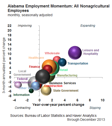
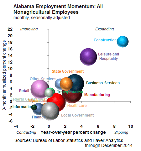
In the charts below, which focus on Alabama, each bubble provides a static representation of a given value while also providing comparative information to other industries. The bubble size in these charts illustrates the most recent three-month average of jobs in that industry. The y (vertical) axis shows the three-month average annualized (or short term) job growth, and the x (horizontal) axis shows year-over-year (or long-term) job growth.
The chart is divided into four quadrants. A bubble in the upper-right quadrant (expanding) indicates positive movement in employment (both short- and long-term measures are positive), whereas the lower-left quadrant (contracting) indicates both measures are negative. The upper-left quadrant (improving) indicates the three-month measure is positive, but we're not seeing positive movement year over year. Lastly, the lower-right quadrant (slipping) is positive year over year, but the three-month measure is negative.
As you can see in the first chart, Alabama's leisure and hospitality employment in December 2013 was in the expanding quadrant. We interpret that as this sector has been making gains over the short and long run. This gain stands in contrast to the information sector, which contracted during both the short and long term, putting it firmly in the bottom-left quadrant.

Now, let's take a look at how some of Alabama's industries are doing. In December 2014, the leisure and hospitality sector was still expanding (gaining 8,800 jobs). According to the University of Alabama's Center for Business and Economic Research (CBER), the increase in leisure and hospitality is the result of staffing in food services and drinking places (restaurants, for example). CBER's Ahmad Ijaz said, "Restaurants are adding jobs all across the country."
The construction sector is in an even better position, moving from a contraction in December 2013 to expansion a year later. The Birmingham Business Journal, in an article from January 2015, said "Alabama is ranked eighth among the 50 states and the District of Columbia in construction jobs added." Likewise, the Alabama Department of Labor reported that Alabama "employment in the construction sector is at its highest point since November 2010."
Finally, a look at the manufacturing industry in Alabama also showed notable improvements. In 2013, it seemed like manufacturing employment was easing into the "slipping" quadrant, indicating a short-run slowdown. But 2014 saw it move firmly into the expanding quadrant. CBER's Ijaz tells us that this is the result of the automotive industry adding jobs from October 2013 to October 2014. He said that Alabama is one of the few states adding jobs in this sector. In September 2014, AL.com reported that Alabama's auto industry was projected to grow 2 percent in 2014 while the rest of the U.S. auto industry would contract about 4 percent.

So now that we've scrutinized past data, what are Alabama's employment projections for 2015? According to CBER's latest forecast, Alabama is expected to see stronger growth in employment in 2015 overall. I look forward to comparing bubble charts later in the year. In the meantime, I think I'll grab a piece (or two) of gum.
By Susan Remy, a Regional Economic Information Network analyst at the Birmingham Branch of the Atlanta Fed


