
Where is the excess slack in the labor force?
Last week, the April Employment report from U.S. Bureau of Labor Statistics reported that the unemployment rate (U-3) edged down slightly to 5.4 percent (after rounding) over the prior month, which is well below the high of 10.0 percent in late 2009. Despite this encouraging improvement, wage growth remains low, and many agree that slack remains in the labor market. The consensus of the Federal Open Market Committee (FOMC) has been that more progress can be made, as noted in the Chair’s press conference in March. One factor we have been paying particular attention to here at the Atlanta Fed is excess slack in the labor market captured in the U-6 unemployment rate, which includes the unemployed, those who are working part-time but would prefer full-time employment (part-time for economic reasons, or PTER), and those who have stopped looking for work during the last 12 months but were willing to work (marginally attached).
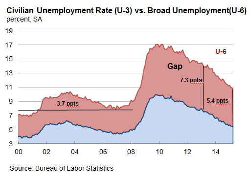
Below is a chart showing the U-3 unemployment rate (depicted in blue) and the U-6 rate (in red). The difference between the two is often referred to as “the gap,” and this area shaded below in light red represents the excess slack in the labor force. Between 2000 and 2008 the gap averaged 3.7 percentage points but then rose to a high of 7.3 percentage points during the recession. Since late 2011, the gap has declined and was 5.4 percentage points in April, but it remains well above the usual amount of excess slack in the labor force experienced earlier in the decade. Earlier analysis by my Atlanta Fed colleague Pat Higgins identified a significant connection between U-6 and the subdued wage growth the economy has experienced in recent years.
Just as the U-3 unemployment rate varies widely across states, so too does U-6.
Below is a map that shows where the gap between U-6 and U-3 was greatest during the first quarter of 2015. States shaded in red have a gap higher than the United States overall, and states with a lower-than-average gap are shaded in green.
Twenty-one states are shaded red, and they are mostly concentrated along the West Coast, the Southeast, and the Great Lakes region. The gaps were largest in Arizona, Nevada, and California, respectively—the so-called Sand States—where the housing boom and bust were most dramatic.
The gap was below the U.S. average in 29 states and Washington, DC. Notably, the central part of the country is shaded green. The smallest gap is in North Dakota, South Dakota, and Wyoming, states that have benefited in recent years from a boom in mining activity or energy extraction.
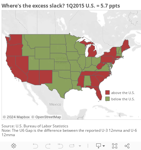
Of course, a large or small gap relative to the U.S. average does not tell us if the gap is unusual. For example, the red states in the chart also tend to be states whose U-3 rate and U-6 rate are also above the U.S. averages.
A way to get a sense of whether the gaps are abnormally high is to compare the gap on a state-by-state basis with that state's average gap prior to the Great Recession. (Here, I use data from 2003 to 2007 to create a prerecession baseline for each state.) As the map below shows, most states remain above their prerecession average gap and are shaded red, although a few exceptions are shaded green and sit slightly below the prerecession average. Nevada and Arizona's gaps remain stubbornly high and actually worsened in the latest quarter.
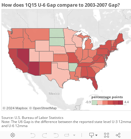
Clearly, many states have a ways to go to attain the average labor market conditions they experienced prior to the Great Recession.
 By Whitney Mancuso, a senior economic analyst in the Atlanta Fed's research department